30 Days with Surface Pro: Day 18
One of the most common uses for tablet devices of all shapes and sizes is as an ereader. For Day 18 of the 30 Days with Surface Pro series, I take a look at how the Surface Pro handles my digital library, and how it fares as a device for reading ebooks in various conditions.
I have a decent collection of books in my Kindle digital library. Unfortunately (for me), I’m way better at finding and buying interesting books than I am at reading them. Of course, that was also true before the advent of the Kindle and the renaissance of ebooks, so the up side is that now I have all of those books at my fingertips no matter where I am–just in case the mood strikes.
Both Amazon–with the Kindle app, and Barnes and Noble–with the Nook app, have been aggressive at ensuring that they’re ereader is available on virtually every platform and device made. The apps themselves are free, but in order to use a Kindle or Nook app, you have to buy a Kindle or Nook book, and both Amazon and Barnes and Noble want to make sure that when you’re ready to buy a new book, you do so from them. With that goal in mind, Amazon and Barnes and Noble were both at the front of the pack when it came time to develop and release apps for Windows 8.
The Nook app looks and feels a lot like the Windows Store app. That might be a function of the partnership between Microsoft and Barnes and Noble (Nook Media LLC), borne out of a patent dispute settlement. According to reports, Barnes and Noble will also be paying Microsoft royalties on every Nook device sold.
The Nook app side scrolls like the Store app, and is broken into sections similar to the different categories of apps in the Windows Store. It starts with something called My Daily Shelf–which I believe holds material available for me to read. I don’t own any Nook books, so my My Daily Shelf hosts a collection of free samples available to download. As I scroll to the right, there are sections for recommended books, magazines, comics, popular books, newspapers, reading material for kids, etc.
I downloaded a sample of the book ‘The Power of Habit: Why We Do What We Do in Life and Business” just to see how the Nook app works. I don’t like it in landscape mode. It displays the text in two columns–I suppose it’s reminiscent of what a book would look like if you held it this way, and admittedly the text would look awkward as well if it just ran all the way across the screen in a single column. It’s obvious, though, that the app is meant to be used in portrait mode. I can simply swipe to the left or right to “turn” the pages as I would with a “real” book. I found the text on the Nook app (or at least in this particular book) to be sort of crowded. It felt like there should be a little more space between characters, words, and paragraphs to make it more visually appealing and easier to read.
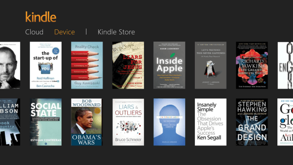
I fired up the Kindle app next. The app has three sections to choose from at the top: Cloud, Device, and Kindle Store. The Cloud section contains my entire digital library of every Kindle book I’ve ever purchased from Amazon. I can click any of those books to download them to the Surface Pro–at which point they appear in the Device section. The Device section contains the books that are stored locally, which means I can read them on the Surface Pro even if I don’t have an Internet connection. The Kindle Store–as the name implies–opens up a virtual book store where I can shop and buy new content for my ereader.
I have no shortage of content available in my Kindle library, so I opened up Stephen Hawking’s ‘The Grand Design’ to examine how it looks and feels on the Surface Pro. Just like the Nook, the Kindle app displays the content in two columns when in landscape mode, as opposed to a single column when in portrait mode. However, in both modes, the Kindle app has better spacing of the text and more white space, which makes it much easier to read.
For both the Nook and Kindle apps, there are settings you can change to customize the look to fit your needs. You can change the size of the text, the spacing of the text, the size of the margins, and more. One thing the Kindle app has, that the Nook app does not appear to have, is an option to switch to a single column of text even in landscape mode. (Note: I was right–it’s actually worse to have a single column of text running across the entire display in landscape mode).
Enough about the apps, though. It’s time to look at how the Surface Pro itself stacks up as an ereader device in the first place. I compared the resolution of the Surface Pro against a Kindle Fire HD 8.9 and an iPad 3 (with Retina display). I looked at the exact same page of the exact same book to see how they compare.
The iPad 3 is by far the sharpest of the three–noticeably better than the competition. The Kindle Fire was respectable, but the “white” background is a tad yellow-ish. The Surface Pro is acceptable. I probably wouldn’t complain, but next to the iPad it looks pretty rough.
Odds are good, though, that I would not be choosing which tablet to buy based on which is a better ereader. If I wanted the best ereader, I’d just buy a Kindle Paperwhite. The point is that once I have a tablet–whichever tablet it may be–I’d like to also be able to use it as an ereader.
Bottom line: the Surface Pro works as an ereader. Whether I’m sitting on the couch in my living room, enjoying a coffee at the corner Starbucks, reading in bed at night, or enjoying a book on a train ride, both the Nook and Kindle apps (as well as other ereader apps I’m sure) offer access to a massive library of options.
The caveat for the Surface Pro is that it’s heavy. It’s not “heavy” per se, but it’s heavy for an ereader. It’s heavier than either the iPad or the Kindle Fire HD 8.9, and neither of those is actually awesome for holding in one hand while reading over an extended period of time. Reading with the Surface Pro is done best with it sitting on a solid surface, or at least in your lap.
Again, if you really want the best ereader, get a Kindle Paperwhite.
Day 17: Changing my mind about Windows 8 split screen
Day 19: Let’s take this show on the road
- Algorithms, Thought Leadership, and the Future of Digital Influence - December 31, 2025
- The Accessories You Need for Your New Gadgets After the Holidays - December 29, 2025
- Shadow AI, Cybersecurity, and the Evolving Threat Landscape - December 28, 2025


My Goodness, “Editor in Chief” your spelling is appalling. How can you claim to be an editor? You don’t even master the most basic spelling rules.
Ever tried comparing `they’re` with `their`? Can you even tell the difference? Apparently not. Let’s confuse the picture. What does ‘there’ mean? There you have it. Your readers think that you have their interests in mind but you cannot tell if they’re happy with your copy. Go back to high school.
Are you fu*king serious?
First of all, there are 1,152 words in this article and not a single one is spelled wrong–so the assertion that my spelling is “appalling” has no basis in fact. Second of all, the issue you identify–mistakenly substituting “they’re” for “their”–is a grammar error, not a spelling error. Third of all, variations of there / their / they’re appear only four times in the entire article and only one of the uses is incorrect.
I write somewhere in the neighborhood of 50,000 words per month. Mistakes happen and I appreciate when readers point them out–when they do so with a remote modicum of courtesy or respect. This article is more than 2 years old and is still one of the most-read posts on the site. It has been seen by tens of thousands of TechSpective readers and you’re the first person to point out the flaw.
Ironically, the frequent confusion of there / their / they’re is a pet peeve of mine as well. I’d normally just say, “Thanks for pointing that out so I can fix it”. With the lack of respect in your comment, I’m more inclined to say “Fu*k off. Go read a different tech news site.”
Hit a nerve, did I?
I agree with Tony- seriously, is that what you took from the review? I do not usually bother to comment, but really? I am going to guess, Ingeborg, that you spend a lot of time at home trolling websites and smugly pointing out mistakes that are, frankly, irrelevant and barely tangentially related to the content. This took me 30-35 seconds to write and now, after reading Tony’s helpful review, I am going to leave this website and find something better to do with my time then point out the mistakes of other people.