The Google logo is probably as powerful as the search engine brand itself. According to a Forbes article, Google was second only to Lego in worldwide brand strength in 2017. Google’s logo history started in 1997 with a beta version that was quickly updated. Google has adjusted and developed the logo throughout the years, with many of the changes remaining unannounced. Today we have the Google logo, its colorless version, favicon, dots, temporary and interactive doodles.
Here are the 5 major changes in Google’s logo over the past 20 years you should learn about:
1. From Beta to Brand: The First Official Logo
Google began as a research project developed by two PhD students. Sergey Brin created a beta logo using an online free platform called GIMP. The old Google logo had a 90’s vibe that would generally be considered ugly by today’s stanards.
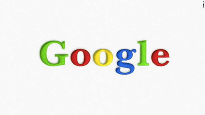
The first official version of the logo was created in 1998 and had a slightly different mix of colors than the logo in use today. The first “G”and the “L”were both green. The logo included primary colors in a slightly different combination and with a slight 3D shadowing. This version was in use for only one month, however, it stands out as being the first official logo and still largely resembles the one you are familiar with.
2. Two-in-One: The Color Change
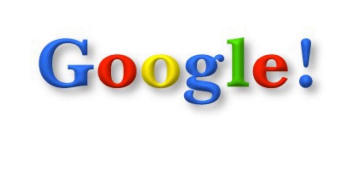
In September of 1998, the green “G” at the beginning was replaced by blue. The 3D effect on the letters also became more visible, but there was no change in the font.
This Google logo also featured an exclamation point at the end. The punctuation discreetly disappeared in May, 1999 due to its resemblance with the branding of Google’s primary competitor—Yahoo! If you’re nostalgic and want to see the old logo, there is an official Google archive that takes you back to those years.
3. Premium Simplicity: The Longest Serving Logo
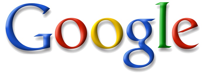
The unannounced logo change which eliminated the exclamation point was essential to the logo history. Google used the logo for one year. However—sans punctuation—that logo remained the basis of the company’s visual branding until 2015.
In the next iteration, the 3D shadowing was even more subtle, and the logo simplified. This placed the search engine among premium brands who aim to be recognizable above all. By now, Google letter edges were completely round and friendly.
4. Most Significant: Google Going Flat
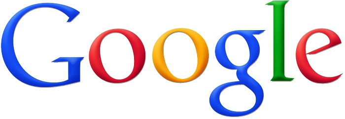
The search engine updated its classic typeface into a custom font for about two years. Graphic designers completely removed shadows and 3D effects. The logo also featured some small typographic changes, such as a straight line from the e letter.
This was simplicity taken even further. Google had no reason to stand out, but it aimed to be closer to its users. This update was a simple revision before the official new logo. However, it paved the way to images that look familiar and logos that people easily remember.
5. Official Rebranding: 2015 to Present
Google introduced the public to an entirely new typeface in September of 2015. The company developed the Product Sans geometric font in-house and spruced up the logo with a modern appearance. The new logo contained rounded letters and more subtle colors. Back then, Google officials stated that this change was meant to make navigation easier and simpler from multiple devices. It was not all about PCs any more.
Google’s first proprietary font is also in use for Alphabet—the corporate brand of Google. Colors now seem connected instead of being in contrast. You now see this logo every time you open the search engine. This logo is also used in a colorless version as a background for some Google Doodles.
Google Visual Branding
Google is working hard to be among the top global brands that people are familiar with. The company developed its brand extension products by inserting elements of the logo and making their connection to Google visible. Google Drive, Google Wallet, Google Maps and Gmail are only a few of the many services and products this “search engine company” now additionally has to offer.
The Google logo is not visible every day in its pure form. On many days, you will wake up to find an interactive Google Doodle in its place. Visual branding is not limited to logos anymore, so creativity has fewer boundaries, but it will always be important for brands to establish a strong and easily-recognized visual identity.
- 5 Ways the Google Logo Has Changed Over Its 20-Year History - March 14, 2018
View Comments (14)
Evolution of Logo Google History
https://www.toevolution.com/blogs/2591-evolution-of-logo-google-history
Happy birth day google
I know a app, a app
that app could not compare with other app
that is GOOGLE app
WISH YOU A HAPPY BIRTHDAY
Happy birthday google
How do I get back to the gmail as it was before??? The new one is hopeless. This is probably not the right place to give my complain, but I need to know how to get the old one. Can someone help me??
Happy birthday Google.
I don't know what you clowns have done to my email account but I cannot access it any more. Please remedy.
Um. We are not Google and we don't host your email. Feel free to address your complaint to your email provider.
GOOD LOGO
I have retired , but my business phone # has been unindated with non stop robo calls .
Please stop all contact it's become rude and intrusive
How many times do you have to call from fake phone# Jesus
Um. I have ZERO clue what you're talking about. This website does not call anyone--robocall or otherwise. I'm sorry you get a lot of robocalls. Welcome to the party. It's part of owning a phone these days. I probably get 10+ a day that I ignore and blocking the number(s) has no effect whatsoever.
I am sorry to say happy birth day to Google
good