30 Days with Surface Pro 3: Day 2
Microsoft continues to impress me with the packaging for the Surface Pro line. Granted, once I get it out of the box and start using it the packaging will be completely irrelevant, but the care and quality of the packaging conveys a certain expectation for the value of the device itself. Shoddy packaging often means shoddy equipment, and the fact that Microsoft put so much thought into the packaging for the Surface Pro 3 suggests that it probably invested as much or more effort in the design and capabilities of the tablet it holds.
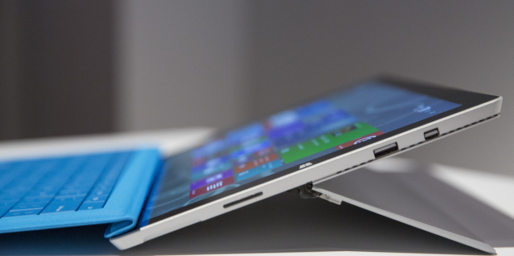
I have the Surface Pro 3 model with a Core i5 processor, 8GB of RAM, and 256GB of storage. Out of the box, it came with the blue Type keyboard cover, the Surface Pen, and the power cord / charger.
In my opinion, this specific model—which costs $1300 without the keyboard cover—offers the best bang for the buck. You can get a Surface Pro 3 starting at $800 for the Core i3 model with 4GB of RAM, and only 64GB of storage, and you can get more powerful models like the Core i7 with 8GB of RAM and 512GB SSD for $1950, but this model has the best balance between price and functionality.
The first thing you notice about the Surface Pro 3 is that it is larger than its predecessors. The Surface Pro and Surface Pro 2 both had a 10.6-inch display with a widescreen aspect ratio—in other words they were much more rectangular. The Surface Pro 3 has a 12.1-inch display that is also more square, giving it a size and aspect ratio more like most traditional laptops or ultrabooks.
Despite being larger, the Surface Pro 3 display actually has higher resolution and pixel density than the Surface Pro 2. The Surface Pro 3 display has a resolution of 2,160 x 1,440 pixels, for a pixel density of just under 215ppi. More importantly, the display looks great. It is bright, and has great contrast. DisplayMate ranked it among the best displays available in a recent study.
The previous Surface Pro models were already marvels of engineering. The fact that Microsoft has been able to squeeze the entire architecture of a traditional Windows desktop or laptop PC into a tablet form factor borders on miraculous.
[inlinetweet prefix=”” tweeter=”” suffix=””]With the Surface Pro 3, Microsoft raises that bar even higher[/inlinetweet]. Even though the Surface Pro 3 is larger, it is actually substantially lighter than the Surface Pro 2—weighing in at a mere 800 grams (roughly 28 ounces). It is also more than 30 percent thinner than the Surface Pro 2 at just 9.1mm (about 0.36 inches) thick.I’m not sure if it’s simply the result of the thinner tablet, or if there is some other engineering or design reason, but the Surface Pro 3 uses a different power connector. It still attaches magnetically in roughly the same location as previous Surface Pro models, but the connector is thin and slides into a slot rather than a port.
One of the most impressive things about the Surface Pro 3 hardware is the new kickstand. The kickstand on the Surface Pro was a neat idea. Microsoft improved on the concept with a multi-position kickstand on the Surface Pro 2, but it was still limited to two positions. The Surface Pro 3 kickstand clicks into the first position like the original Surface Pro, but after that it uses resistance to extend more or less infinitely to just about any angle you choose—almost to lying flat.
[inlinetweet prefix=”” tweeter=”” suffix=””]In a word, the Surface Pro 3 is impressive right out of the box[/inlinetweet]—especially after having used both the Surface Pro and Surface Pro 2. It has a solid, quality feel to it, combined with a weight and thickness that are closer to a standard tablet like an iPad Air.I’m looking forward to digging in and seeing what this thing can do.
Day 1: 30 Days with Surface Pro 3
Day 3: Logging in to Windows 8.1
- AI Voice Clones and Mobile Phishing: The Cyber Threats You’re Not Ready For - July 11, 2025
- Rethinking Cloud Security for the Evolving Threat Landscape - July 11, 2025
- Why Data Security Is the Real AI Risk - June 30, 2025


Comments are closed.