I have been using Outlook for iOS as my default email client on my iPhone since Microsoft launched it earlier this year. Today, Microsoft is rolling out a fresh new look for Outlook for both iOS and Android that incorporates a variety of subtle updates that improve the experience and make using Outlook on mobile devices more efficient.
Back in February I wrote about the top 5 reasons Outlook for iOS is my new favorite email app, and why I made it my default email app on the iPhone. Those reasons included things like the ability to have multiple email accounts, the Focus element of the Inbox that segregates important messages, and the integration with cloud storage and greatly simplified access to file attachments, among other things.
Many of the refinements in the new Outlook apps for iOS and Android are a function of working with the team from Sunrise and incorporating some of the design elements from the popular calendar app acquired by Microsoft in early 2015. Javier Soltero, corporate vice president for the Outlook team at Microsoft, wrote in a blog post, “We tweaked UI elements, by adding visual cues to help you see and process information more quickly at a glance. We also improved navigation around the app and made key features more prominent—so you can do more with fewer taps. When getting work done on the go, it’s these little time savers that count.”
Soltero also talked about the relationship with Sunrise and what the Sunrise team brings to the table. “The Sunrise team is now officially a part of the broader Outlook product team, bringing a fresh approach to calendaring and combining it with Microsoft’s deep expertise in both email and calendar. Better Outlook calendaring gives you more ability to manage your personal and professional life from a single, powerful app.”
Having used the Outlook app on iOS as my default for eight months now, I can say that the changes in the new version are minor—visually speaking. At first glance the new iOS app looks just like the app I’ve been using. I got early access to the new app, though, so I can also say that the tweaks and changes are effective and make a difference. I commend the developers at Microsoft for being able to alter the user experience without fundamentally changing the app itself.
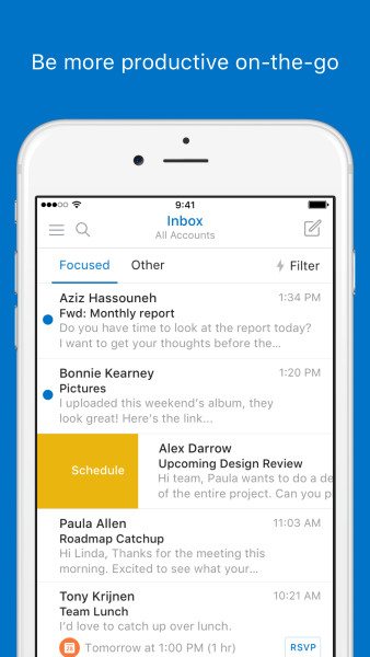
Many of the design changes are small and subtle, but make a big difference. For example, the message list now clearly calls out invitations so you won’t miss them. The event icon makes it easier to pick out events at-a-glance and it’s simple to RSVP to the event from a clearly marked button displayed right in the inbox. A lot of the updates are about shifting focus so that the important information catches your eye, and about making it simpler to access the most commonly used features.
I spoke with Soltero this week and he told me that there are almost 30 million users of Outlook on smartphones and tablets. About 20 percent of those 30 million users are accessing more than one email account through Outlook and Outlook on mobile devices accounts for about 1.2 billion sessions per month. Soltero explained that despite the persistent claims that email is passé or a dying medium for communication, the reality is that it’s part of the fabric of the Internet and it’s here to stay for the foreseeable future.
Microsoft’s mission is to make email awesome. The latest Outlook app for iOS and Android is proof that the acquisitions of Acompli and Sunrise are paying dividends. Check out the new app and let me know if you decide to make it your default mobile email app as well.
- Key Insights from Coalition’s 2024 Cyber Claims Report - April 24, 2024
- Unpacking the Marketing Challenges of Small Businesses in 2024 - April 23, 2024
- Navigating the Rising Tide of Phishing and BEC Threats - April 23, 2024


Great article Tony!