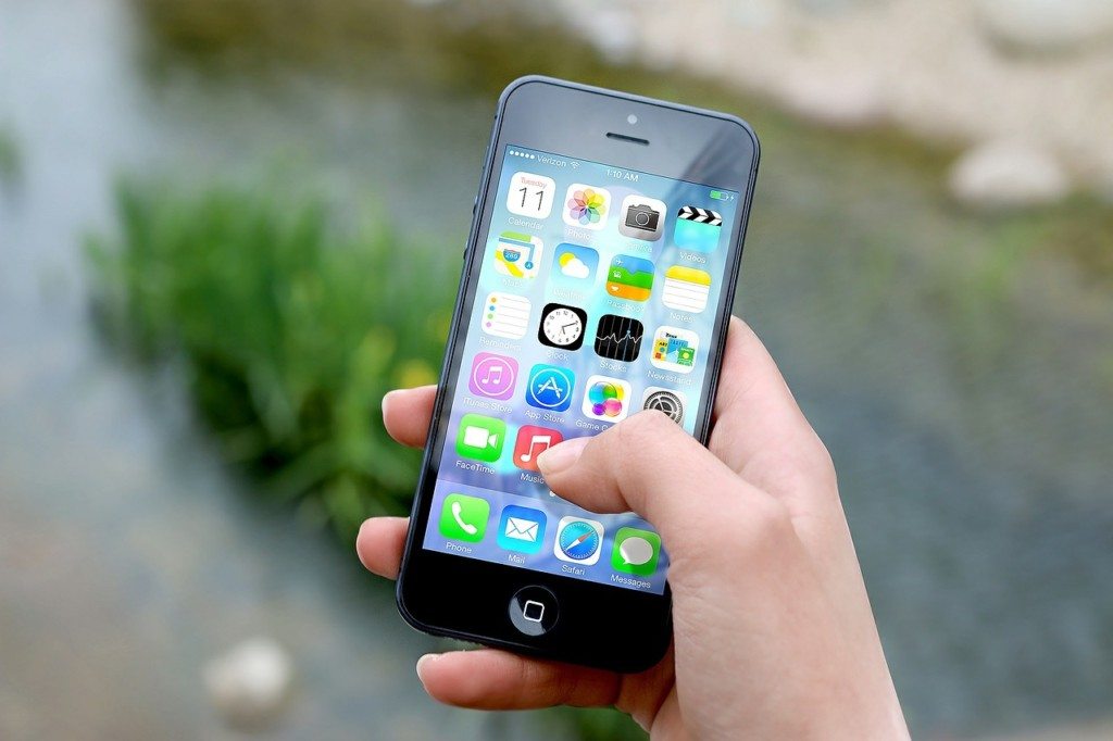
Any organization, large or small, probably needs an app. Whatever your product, an app can provide visibility, great product experience and customer satisfaction. But when hiring an app developer or an app development company it can be difficult to know what you are looking for. The easiest solution to this is to look at their collection of past works. Looking through their portfolio, download each app and assess its quality individually. This should let you know whether the hire is any good at Apple iOS app development. But what makes a good iOS app?
What Does Apple Say?
There’s no better source of information on great app design than Apple themselves. And funnily enough they actually have an entire web page full of tips for app developers. Even if you are not yourself designing the iOS app, it’s still useful to check out when assessing the quality of a potential hire’s work. Some of the top tips are found in checklist form below:
- Is the content formatted correctly?
- Ie do you have to horizontally scroll on the app? This massively decreases user experience.
- Touch Controls?
- When inputting dates, values etc, does the app make use of touch controls? Or does the user have to manually input the numbers?
- Are the Hit Targets big enough?
- Is the text legible?
- Is the size and issue or the contrast all wrong?
- Is the resolution ok?
- If you can see pixelation, it’s not.
- Does the app organise information in a way that is easily understandable?
- Does the app align data with menu options correctly?
Make sure you check out the Apple web page for more detailed explanations of these tips.
What Do Others Say?
While Apple’s tips are certainly useful, you might view them as more of a “red flag” checklist. If an app developer has done any of the above in their previous work, then that’s a massive faux pas and you should think about looking elsewhere. Making beautiful iOS apps like Uber or AirBnB is about something more. These apps just seem to work. They look slick. They feel easy and “intuitive”. But how exactly do you get that “intuitive” feel?
Adam Spool, the user experience app guru, wrote a blog piece on this topic that slipped under the radar a few years ago. If you’ve got the time, I highly recommend reading the entire thing—even if you aren’t designing apps yourself as mentioned before. In essence, Adam argues that applications need to get the user from their current point of knowledge to the “target point” of knowledge. This “target point” is the knowledge the person needs to complete tasks on your app.
He argues you can achieve this in one of two ways.
1. You teach the individual to use the app through tutorials, or
2. You design it so it is so obvious that the user works out how to get to the target knowledge point without really knowing how they did it. This hides their “knowledge gap”.
No doubt both of these are very hard things to do—and I’m not going to elaborate on the ins and outs of how to achieve them here. But keep this current vs target knowledge theory in your mind when assessing a developer’s previous works. It will help you fish the best designers from those that just know how to make a flashy looking interface.
- What Makes a Good Apple iOS App? - January 24, 2018
- Will Advanced Apple Watch Apps Make Family Doctors Less Popular? - November 3, 2017


great job with the post. loved reading it. thanks.
Nice post. Thanks for the sharing
Hi,
Thanks for sharing such informative content.