30 Days with Surface Pro 3: Day 10
The Start button—or lack thereof—has been a controversy since Microsoft launched Windows 8. It has continued to evolve through Windows 8.1 and now throughout the Windows 10 Technical Preview builds. The Start button, or menu, or screen, or the menu / screen hybrid thing that exists now (can we call it a “meneen” or maybe a “screnu”?) is a focal point for navigating the Surface Pro 3, so let’s take a look at how it works, and how to configure it so it works best for you.
First the Start button was gone. There was much wailing and rending of garments in the streets. In other words, people were not happy. The Start button was replaced with a Windows logo button that simply toggled back and forth between the tiled Modern UI Start screen, and the more traditional desktop mode.
In response to the backlash, Microsoft made some of the Start button functionality available by right-clicking the Windows logo. That was not enough to appease customers, or undo the damage for having the audacity to modify the Start button behavior, so Microsoft brought back virtually all of the legacy Start button functionality in Windows 10. Now it is some sort of Frankenstein-esque mashup of the traditional Start menu and the Windows 8 Start screen all rolled into one.
Personally, I preferred things the way they were in the original Windows 8. At least in Windows 8.1 you could still configure the Windows logo to behave like it did in Windows 8—simply toggling between the Start screen and the desktop. In the Windows 10 Technical Preview that’s apparently no longer an option, so I guess it’s time to get used to this Start “screnu” and get it set up the way I want it.
The behavior in Windows 10 Technical Preview build 9986 is similar to the merged Start button experience I wrote about when the Windows 10 Technical Preview first became available:
“The left panel looks and acts like the Start Menu in older versions of Windows — with shortcut links to favorite and recently used applications, plus a link you can click to surf through all of the installed applications and launch whatever you like. The right side of the Start Menu, on the other hand, is comprised of tiles like those from the Windows 8 Start Screen. You get both worlds merged together.”
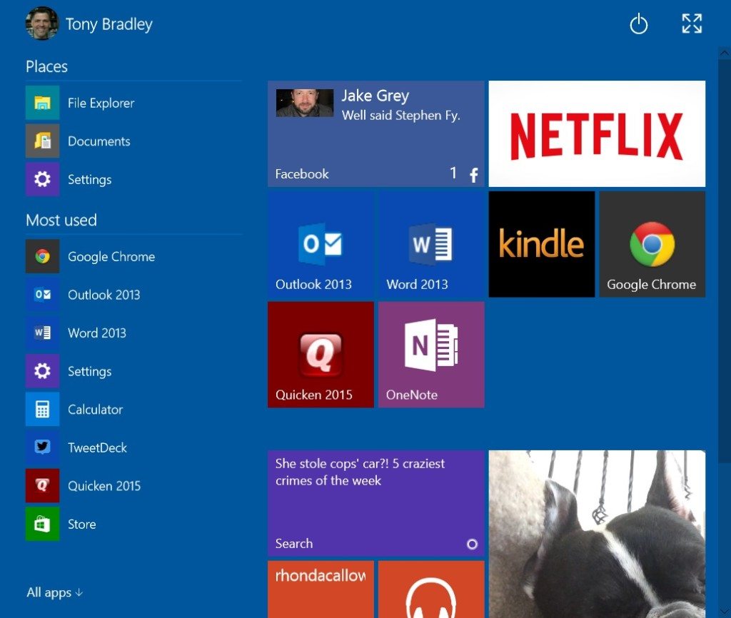
What happens when you click the Windows logo at the bottom left of the screen is that a Start menu / screen box appears. At the top left is the logged in account, and you can click there to change account settings, lock the PC, or sign out. At the upper right is the power icon. You can tap or click it to bring up options to put the PC in sleep mode, shut it down, or restart it. There is also an icon with arrows at the upper right that we’ll talk about in a minute.
Like in the previous Windows 10 Technical Preview build the left column of the Start menu looks more or less like the Start menu you’re used to from Windows 7 and earlier versions of the operating system. At the top is a list of “Places”, which includes File Explorer, Documents, and Settings, and beneath that are icons and shortcuts to the most used apps. At the very bottom you can click the All Apps link to expand the list and scroll through all of the software installed on the PC.
The right side is where you place tiles á la the Windows 8 Start screen. You can right-click apps from the list of apps in the left column and choose to pin them either to the Task Bar or to Start. Pinning to Start places a tile in the Start menu. If you right-click on the tile, you can change the size to small, medium, large or wide (some tiles don’t offer all of these choices). You can also drag the tiles around to rearrange them as you like. You can segregate groups of tiles and name the sections to separate productivity apps from entertainment apps, or social media apps from games. If your tiles exceed the available space you can scroll up and down through them.
That icon in the upper right with the arrows toggles between the Start menu and the Start screen. In this case the Start screen is basically just a full-screen super-sized version of the Start menu you’ve laid out. A new icon with arrows pointing in the opposite direction appears at the upper right of the Start screen. As you probably guessed, clicking or tapping it reverts back to the Start menu mode.
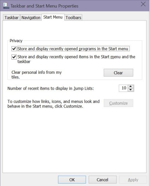 If you right-click on the Task Bar, select Properties, and go to the Start Menu tab you will see a button that says “Customize”. Unfortunately, it’s grayed out right now and doesn’t actually do anything. It seems reasonable to assume that once Microsoft enables this feature it will let you do things like customize which apps appear in the column on the left, or which tools are included in the Places section, among other things. For now, you can’t change those things.
Personally, I expanded the Start menu to Start screen mode and I intend to leave it that way. It took a little getting used to when I first started using Windows 8, but the tiles—and the ability to resize and group them as I choose—is a significantly better and more efficient way to find and navigate apps than scrolling through a list in the menu.
Let me know what you think. Do you like the current version of the Start menu in Windows 10? Do you still miss the old-fashioned Start menu from Windows 7, or do you like the Start screen and the tiles from Windows 8 on?
Day 9: Switching gears to Windows 10
Day 11: Longer battery life
- Smart Holiday Gifting: The Best Tech Under $75 for 2025 - November 26, 2025
- From Polymorphic Attacks to Deepfakes: The Shifting Threat Landscape - November 25, 2025
- Anaconda Wants To Bring Order to Enterprise AI Chaos - November 20, 2025

How do you right-click on a surface pro 3?
I assume you mean just on the tablet itself–not using any sort of Type keyboard cover or attached keyboard. To right-click on the Surface Pro 3 (and other Surface Pros), just tap the item you want to right click and hold your finger there for a second. A small box will appear around your finger, and when you remove your finger the right-click action will execute or right-click menu will open.